An app to find other gamers with similar interest
Gammer Connect
Techniques Used:
Secondary Research
Competitive Analysis
Survey
Style Guide
Wire-framing and Prototyping
Testing and Iteration
Project Overview
Background
For this project, I developed a streamlined app featuring a video game social connection feature. My focus was on researching, identifying issues, and designing prototypes to complete the project.
Project Goals
I aimed to grasp gamers' preferences for social interaction - whether they find more enjoyment in playing alone or with others, their preference for casual or competitive gameplay, and their interest in gaming channels. Additionally, I explored potential issues users may face with gaming apps, investigating reasons for non-usage and identifying any inherent problems with app usage.
My Role:
UX Research
User Experience
UI Designer
Tools:
Figma
Adobe Illustrator
Google survys
Duration:
4 weeks
80 hours
Design Process
Origin
Having played numerous video games, I've struggled to find gaming companions. While online gaming allows connections, my focus on gameplay often hinders forming friendships. For this project, I explored existing apps, assessing their functionality and more.
Research
Surveys
Overall Thoughts
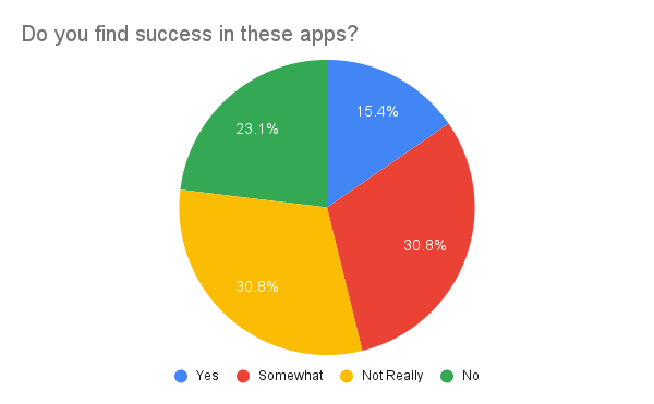
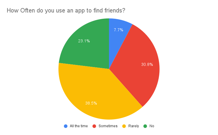
In my UX project to develop a gaming connection app, I conducted targeted surveys and interviews to understand user pain points, frustrations, interests, and preferences. The participants were primarily gamers interested in connecting with others. The surveys aimed to gather both quantitative and qualitative data, providing valuable insights into user needs..
Competitive Analysis
In this thorough competitive analysis, I delved into the realm of gamers connecting by examining competitors such as Plink, Unblind, Gamerlink, and GamerTree. Through intensive research, I gleaned valuable insights into each company's styles, features, and strategies, providing key points for understanding the landscape of video game connections.
Define
Personas
After synthesizing insights from user interviews and surveys, I crafted personas to visually represent users' desires for the app:
Michael Jones, a popular Twitch streamer, seeks friends for more intimate gaming experiences, avoiding broad invitations from his fanbase.
Dannielle Grass, a newcomer to gaming, struggles to find like-minded players outside her non-gaming social circle, preferring not to make friends during gameplay.
Affinity Map
From user surveys and interviews, I collected extensive feedback. Utilizing affinity mapping, I categorized responses into common themes, revealing key stressors, positives, and issues. This visual representation aids in identifying and prioritizing areas for improvement, empowering me to focus on solving the app's crucial problems in my design process.
Key Takeaways
Overall Safety: Users desire a secure network focused on connecting with friends who share an interest in video games.
Regular Updates: A common complaint from my app research revealed users' dissatisfaction with outdated apps riddled with bugs and issues.
Social Discovery: Apps are preferred for connecting with like-minded individuals, offering a convenient alternative to traditional methods of finding people with similar interests.
Ideate and Design
Site Map
Armed with gathered information and visual representations, I kickstart the design phase. The initial step involves creating a sitemap to outline the steps for each app feature. Sitemaps help streamline the path to the final objectives, aiding in visualizing the design by presenting a clear list of objectives for the project.
Task and User Flow
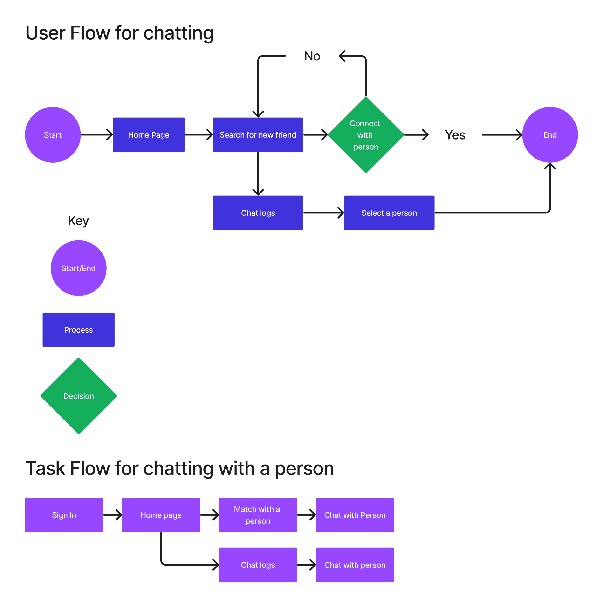
With the site map detailing the app's pages, I proceed to the next step: crafting efficient pathways. Utilizing task and user flows, I gain insights into the user's journey. Task flows provide a broad overview, outlining the fundamental user path, while user flows delve into intricate details, elucidating the journey to the feature's conclusion.
Design
Mid Fidelity Frame
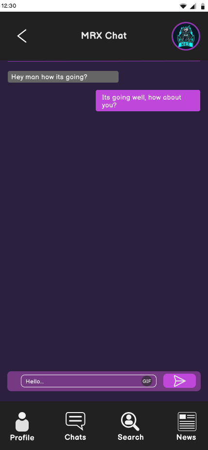
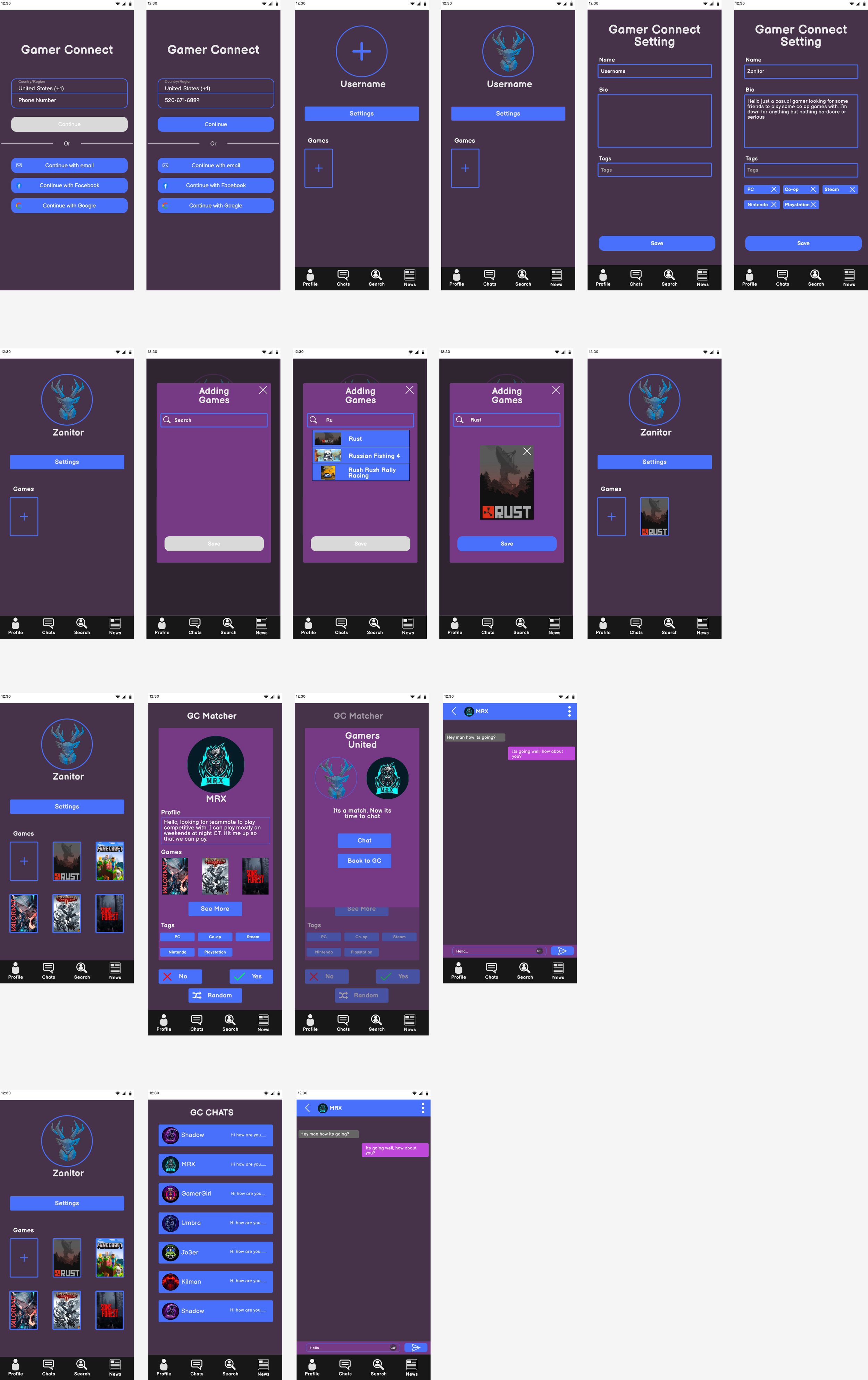
Moving forward, I'm crafting a Mid-Fidelity wireframe to enhance my understanding of user interactions, design aesthetics, and overall functionality. This stage introduces color, symbols, and text, providing a more refined yet still rough representation of the end product. Opting for a calming palette of purple and blue, reminiscent of gamer aesthetics, I expanded the frames to outline the user journey and task completion steps more comprehensively.
High Fidelity Frame
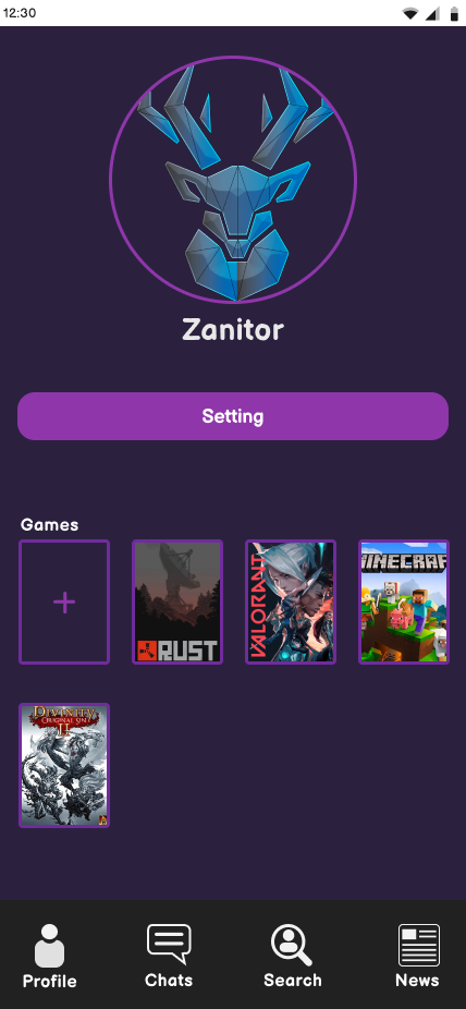
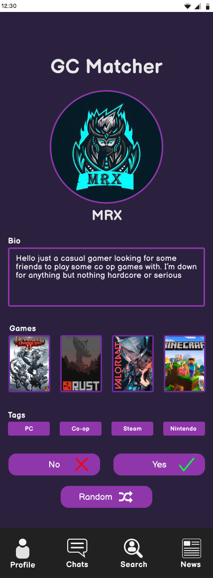
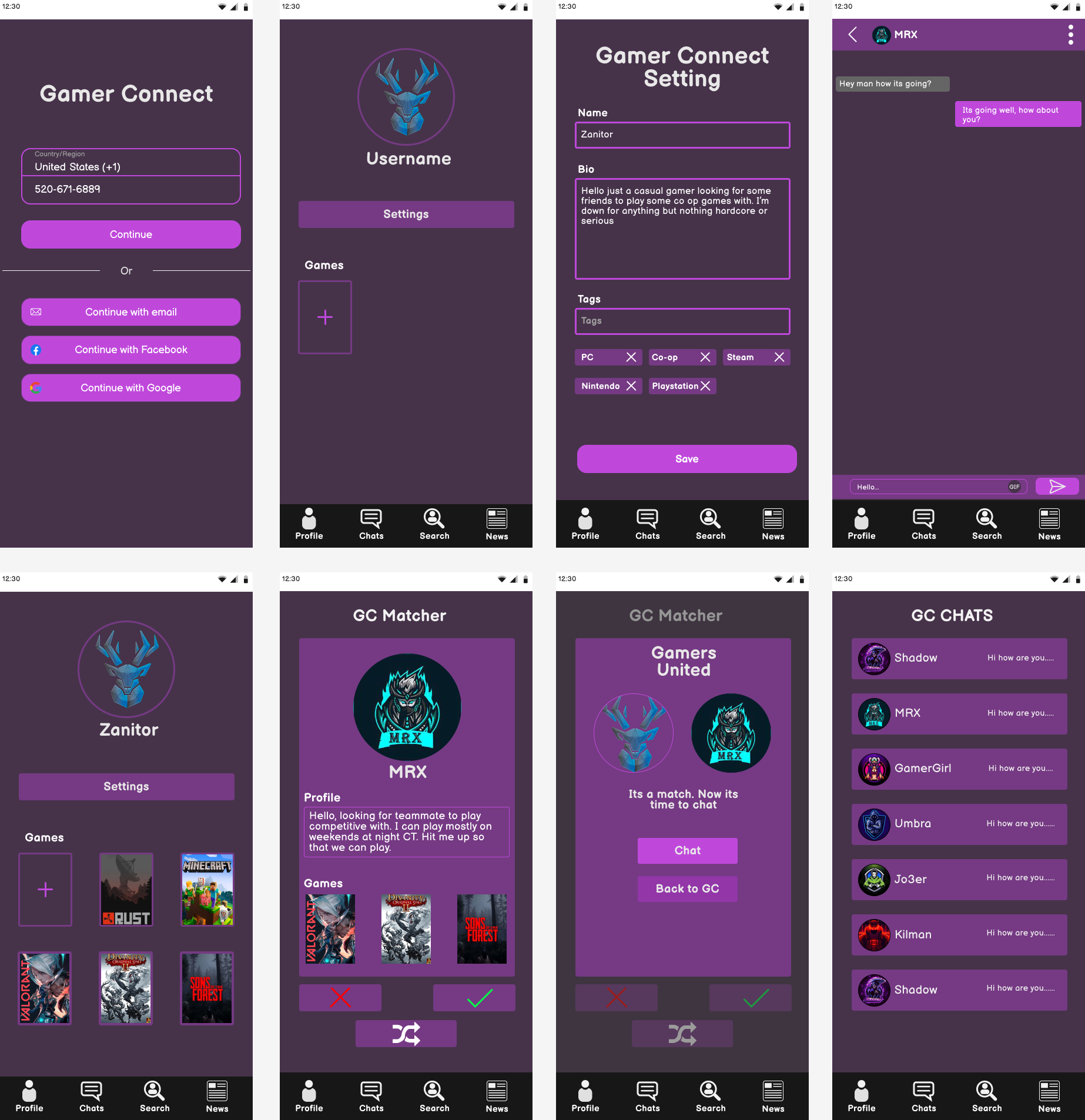
Advancing in my design process, I transitioned to the High-Fidelity wireframe, where all components seamlessly integrate. While Low-Fidelity outlines the app's layout and Mid-Fidelity explores color and visuals, High-Fidelity fine-tunes the design, addressing any issues and presenting a preview of the final product. Notably, I rectified spacing concerns using a graph layout for uniformity. The initial color scheme lacked vibrancy, prompting a shift to a monochrome purple palette with varying shades for a more appealing and cohesive visual experience.
Branding:
Inspired by the user base of gamers, I drew inspiration from Discord's monochromatic color scheme. Research revealed a widespread preference for this approach in apps. Opting for purple not only distinguishes my design but also resonates with the gaming community.
Ui Kit:
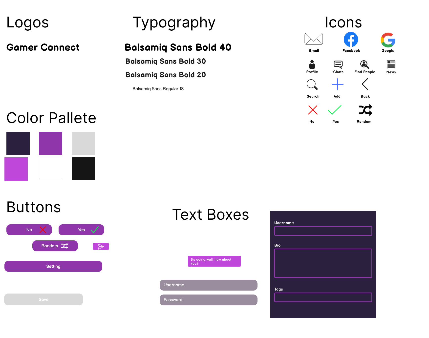
I made several adjustments to my UI kit, primarily altering the color scheme to purple. This choice complements a dark background, offering a cool tone that can transition to an active feel in lighter settings. The purple hue aligns seamlessly with the gamer motif I aimed to convey.
Logo and Icons:
Opting for simplicity, I chose a font-style logo for its ease of use and recognition. This style is effective when starting an app or logo trend. To streamline, I condensed "Gamer Connect" to the initials, GC. Icons were kept standard for easy understanding, with the addition of a custom random icon inspired by the shuffle button on Spotify.
Low Fidelity Wire-Frame
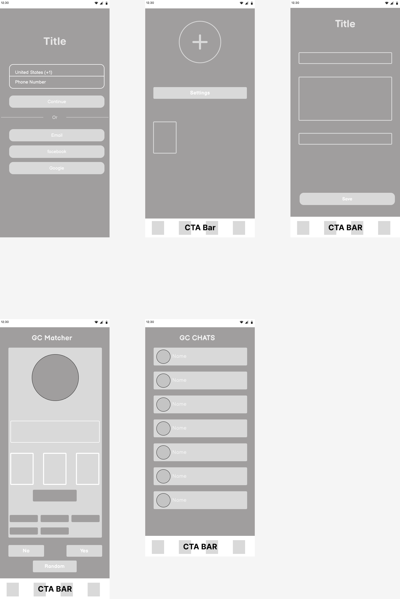
Guided by the app's overall concept, I initiated the creation of a Low-Fidelity wireframe for a fundamental design preview. Key screens, including login, home, info, matcher, and general chats, were roughly outlined. Low-Fidelity serves as a blueprint, offering insights into both the design structure and functionality, facilitating a preliminary understanding of the app's working
Usability
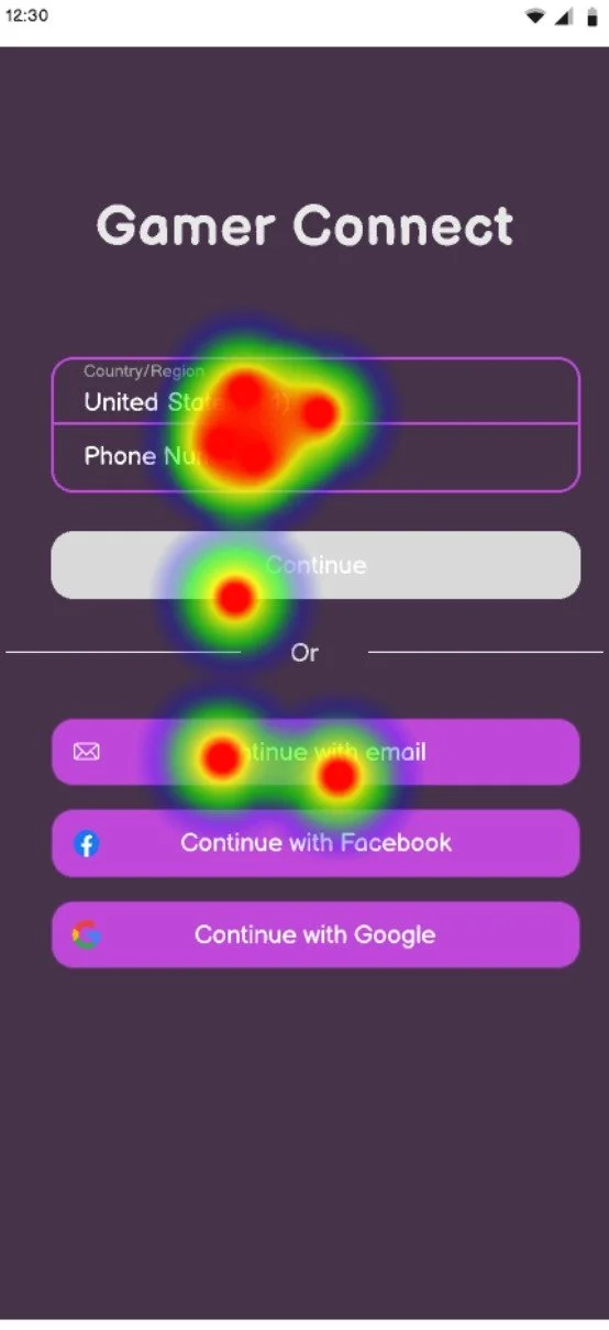
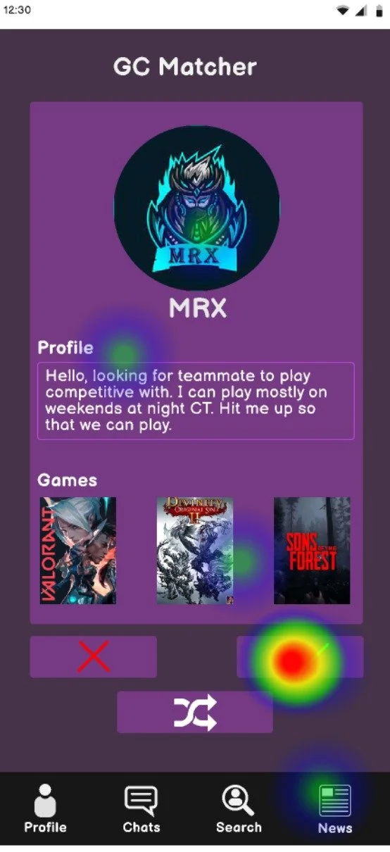
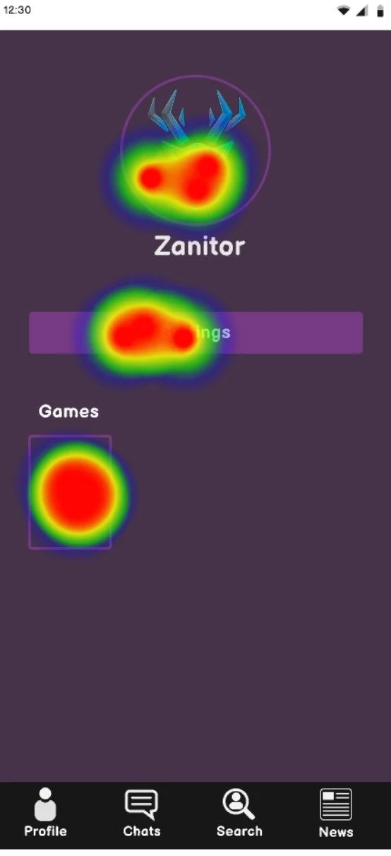
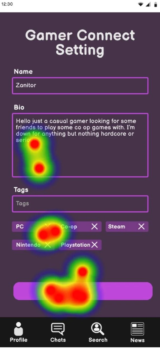
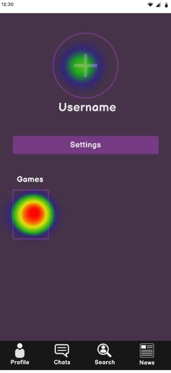
For the final project phase, I tested the functionality of Gamer Connect through usability tests on the Maze website:
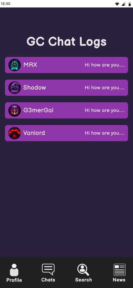
Users, tasked with creating an account, making a profile, adding games, finding someone to chat with, and engaging in chat logs, navigated the app in about 20 seconds.
Feedback highlighted minor alignment issues, and promptly addressed post-tests.
Notably, users observed the app lacked a complete prototype, offering only one pathway to the goal instead of exploring various button functionalities.
Final Thoughts
Takeaways and Iterations
Simplicity in UX/UI design, though seemingly straightforward, entails a challenging journey. This project underscored the importance of meticulous steps in achieving a refined concept.
Graphs played a crucial role, aiding in spacing, positioning, and elevating the project's professional appearance.
Realizing the significance of outlines, I pivoted to low-fidelity wireframes after encountering alignment issues in mid and high-fidelity stages. This shift ensured proper placement and alignment.
For future iterations, I'd consider incorporating a news and events path, conduct targeted audience tests to refine performance and identify desired features, and ultimately launch the app, evaluating its market reception.

