Adding a feature to Netflix
Project Overview
Background
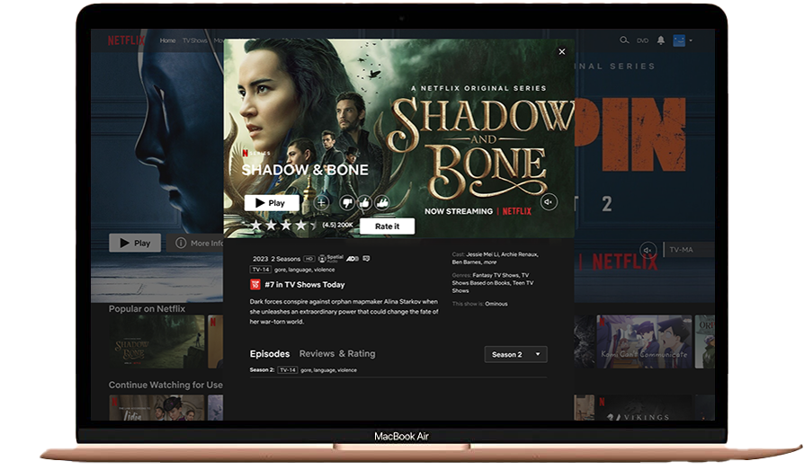
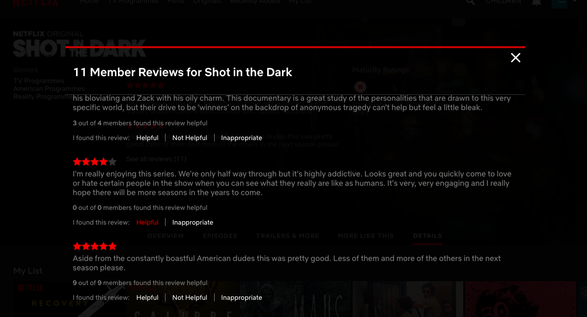
For this project, I'm tasked with enhancing an existing product without altering its style or design. I've chosen to reintroduce a feature to Netflix: the comment and review section was removed around 2018. Comments and reviews are vital for shows, enabling audiences to share their opinions.
Project Goals
Do reviews influence viewing choices? Are they reliable indicators of quality?
Do reviews influence decisions on whether to produce a second season?
Techniques Used:
Secondary Research
Competitive Analysis
Survey
Style Guide
Wire-framing and Prototyping
Testing and Iteration
My Role:
UX Research
User Experience
UI Designer
Tools:
Figma
Adobe Illustrator
Zoho Surveys
Duration:
4 weeks
80 hours
Design Process
Origin
Netflix, founded in 1997 by Reed Hastings, initially provided DVD delivery services. In 2007, it shifted gears by introducing its streaming service, marking a significant turning point. While Netflix once had a reviews and comment section, it discontinued it in 2018 due to low usage. It replaced this feature with a match system, tailoring shows to individual viewer preferences.
Research
Surveys
Overall View
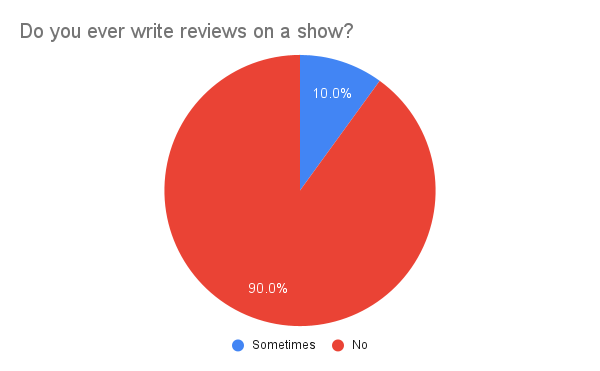
As part of my UX project for Netflix, I conducted interviews and surveys to gather insights on customer preferences and pain points related to leaving reviews and ratings. The surveys were distributed to users of streaming apps, including Netflix, to collect both quantitative and qualitative data. Interviews provided deeper insights into individual usage patterns and interactions with streaming apps.
Competitive Analysis
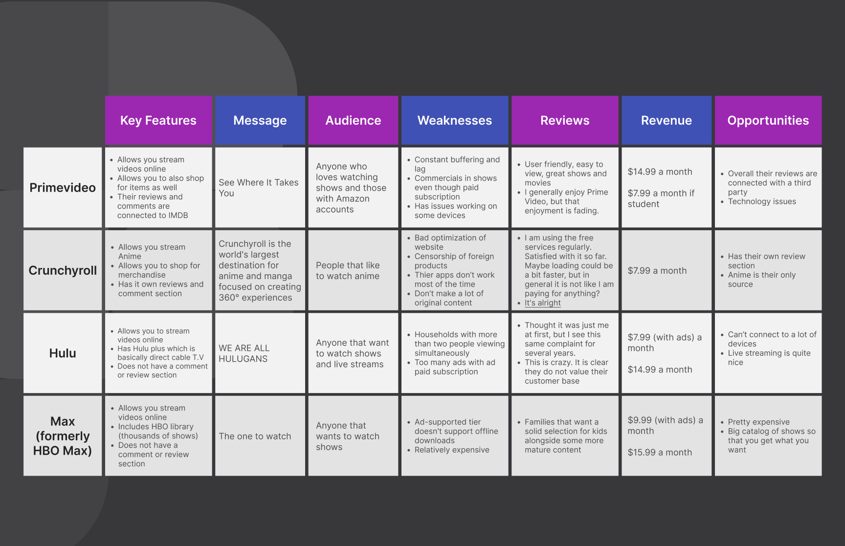
The next step involves a thorough competitive analysis of streaming platforms such as Prime Video, Crunchyroll, Hulu, and HBO Max. This research will yield valuable insights into their review and rating systems, as well as other features, informing the development of our own review and comment feature for Netflix.
Define
Personas
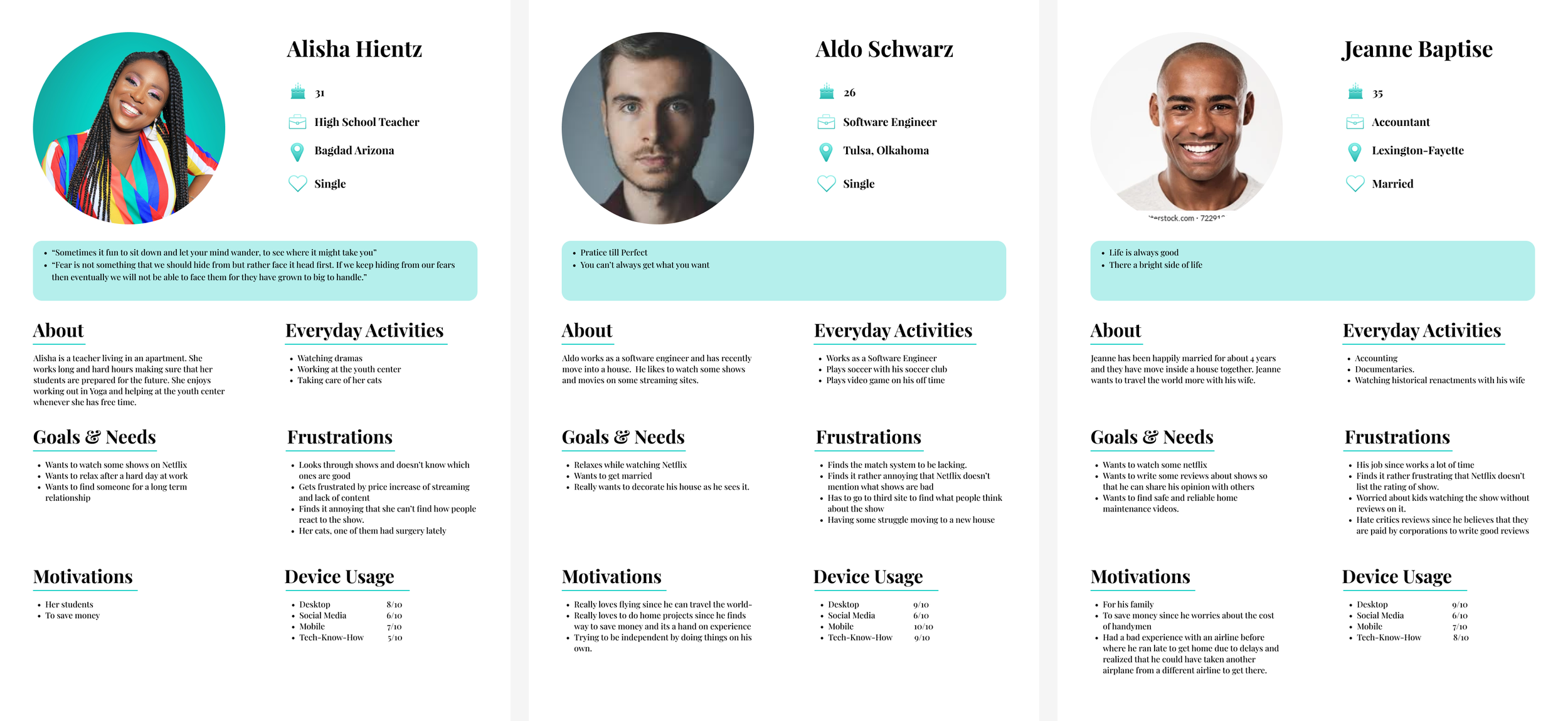
I developed personas based on insights gathered from user interviews and surveys to visually represent users' needs and preferences for leaving reviews and comments on Netflix.
Alish Hientz, a high school teacher, uses Netflix to unwind but struggles to choose shows. She values comments to gauge others' opinions before investing time.
Aldo Schwarz, a Software Engineer, enjoys writing reviews but is frustrated by Netflix's lack of a review feature, resorting to third-party sites.
Jeane Baptise, an Accountant, relies on reviews to quickly select family-friendly shows for leisure. He wishes Netflix had a rating system to streamline his decision-making process.
Affinity Map
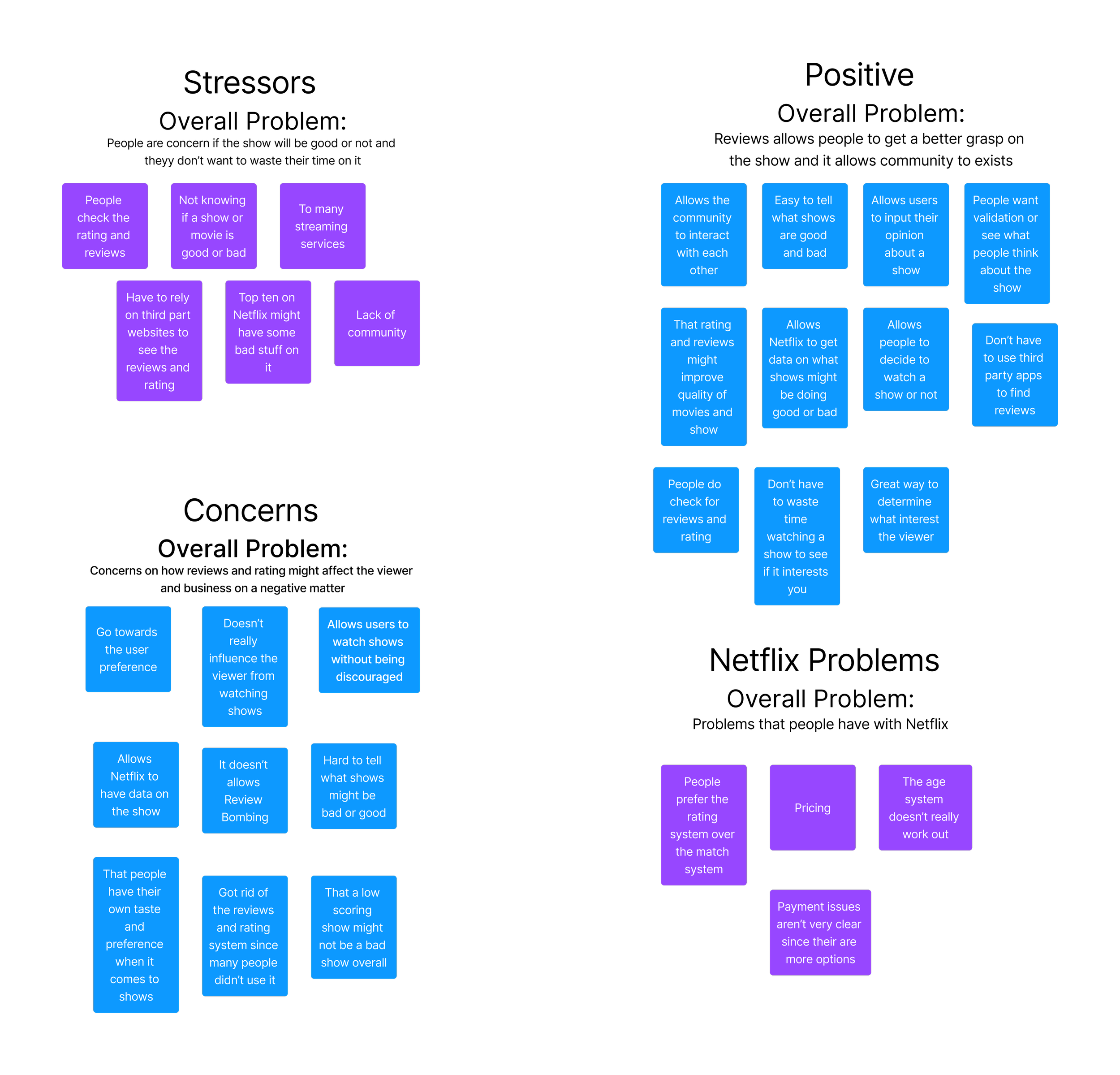
Using user surveys and interviews, I collected valuable insights and feedback. Employing affinity mapping, I organized user responses into categories to reveal common themes and patterns, such as stressors and positives. This visual representation enabled me to identify and prioritize areas for improvement, guiding my design thinking process towards addressing key user needs and challenges effectively.
Key Take Aways
Regarding the match system, despite some skepticism about its efficacy, it remains in use.
As for reviews and comments, while desired by users, engagement is limited, possibly validating Netflix's stance.
Conversely, some users express concerns that reviews may distort perceptions of shows.
Ideate and Design
Site Map
With the gathered insights and visual representations, I'm ready to begin designing. I've started by creating a sitemap to outline the steps for each feature in the app, aligning with Netflix's existing structure while incorporating my additions. This ensures a streamlined approach towards achieving the project's objectives.
User and Task Flow
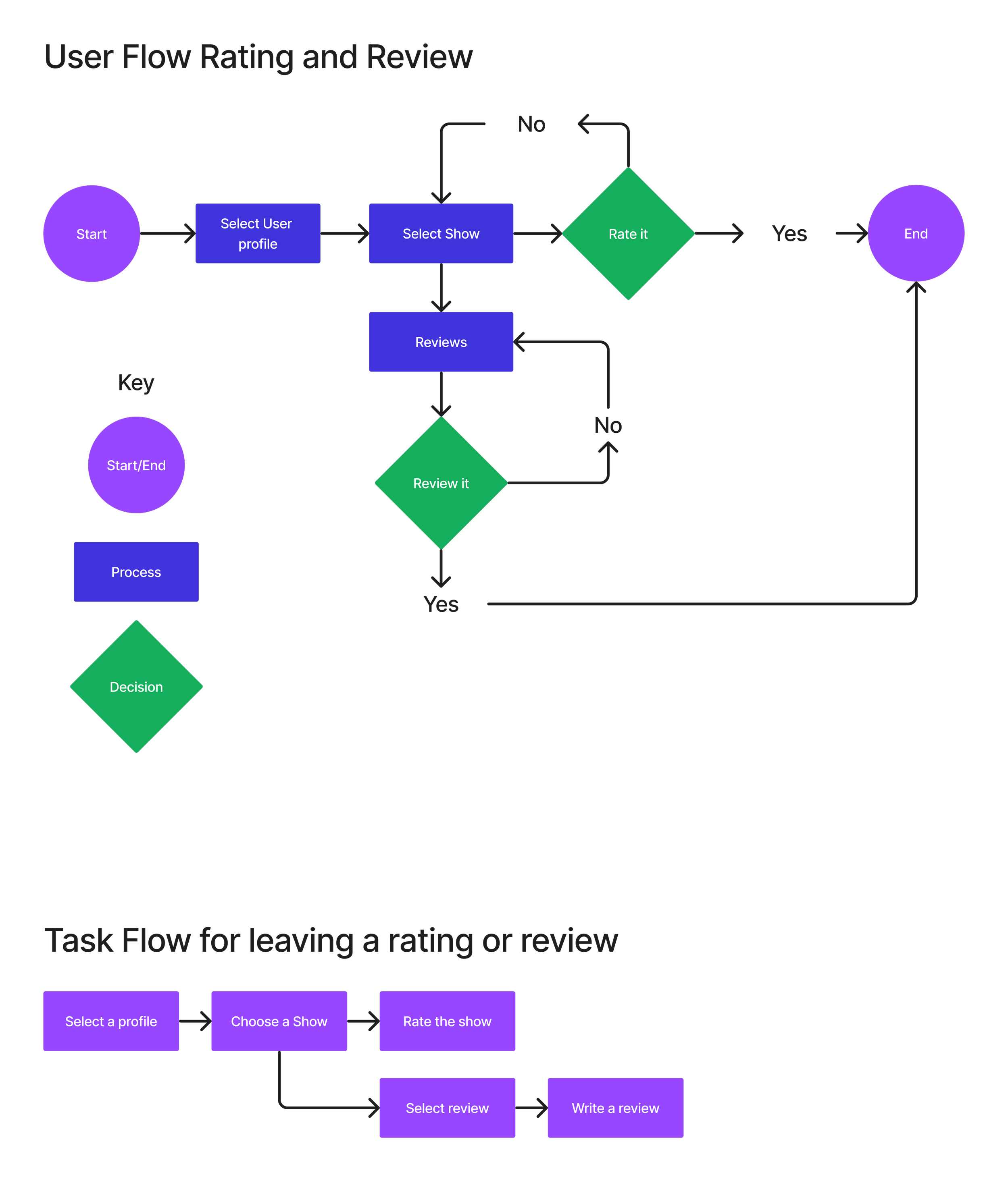
Now equipped with a clearer vision for my project's requirements and concepts, I'm moving on to crafting pathways for utilizing the feature. This involves creating both task and user flows. Task flows provide an overarching view of a user's journey from start to feature, while user flows offer detailed insights into decision points, potential paths, and functionality.
Design
Low Fidelity Frames
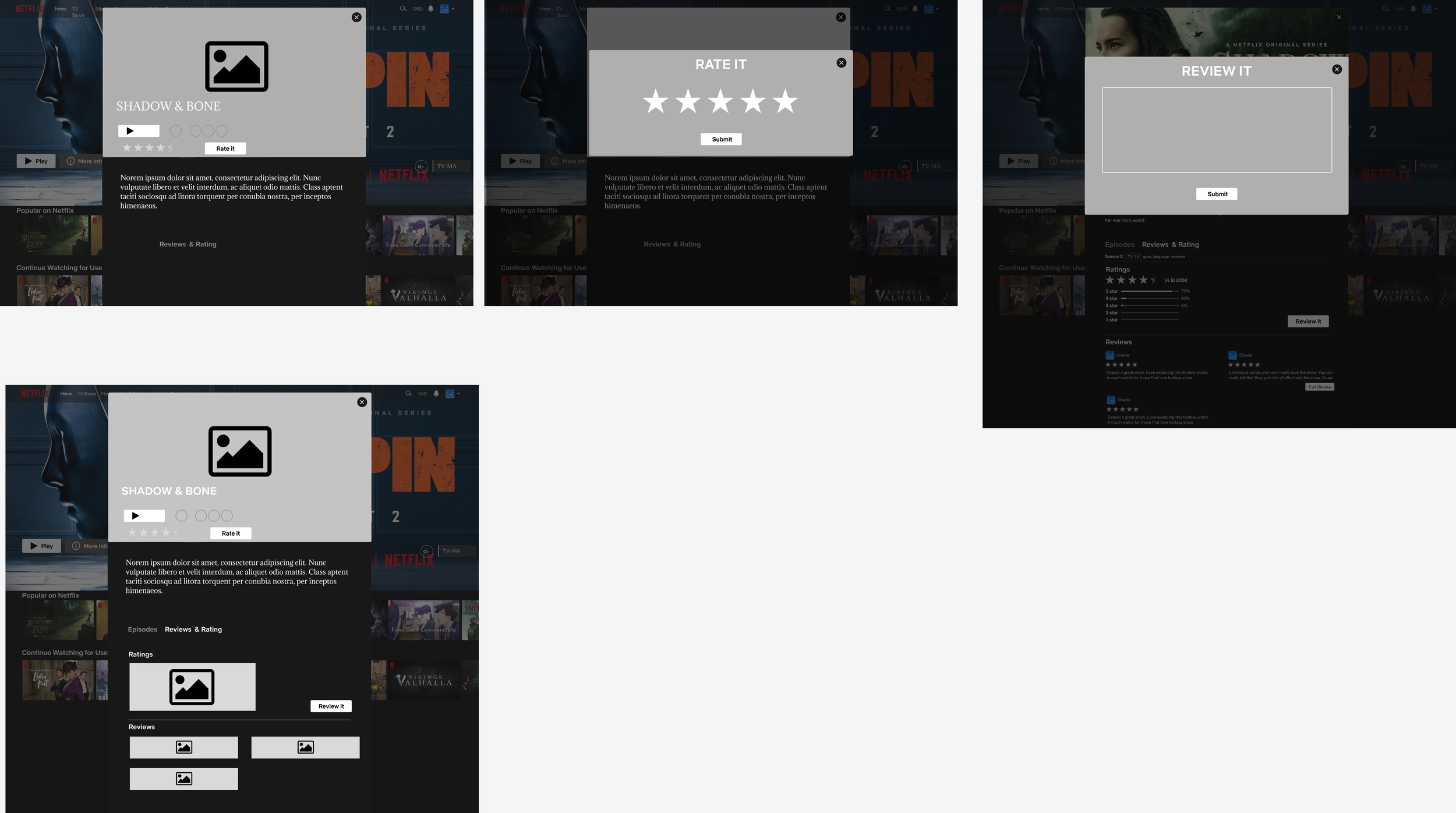
I began with a Low-Fidelity wireframe to outline the basic functionality of my feature within Netflix. This involved sketching a rough layout of a show's interface to explore potential placements for the review button and the location of reviews. Low-Fidelity wireframes serve as blueprints, offering insight into design and functionality before diving into more detailed iterations.
High Fidelity Frames
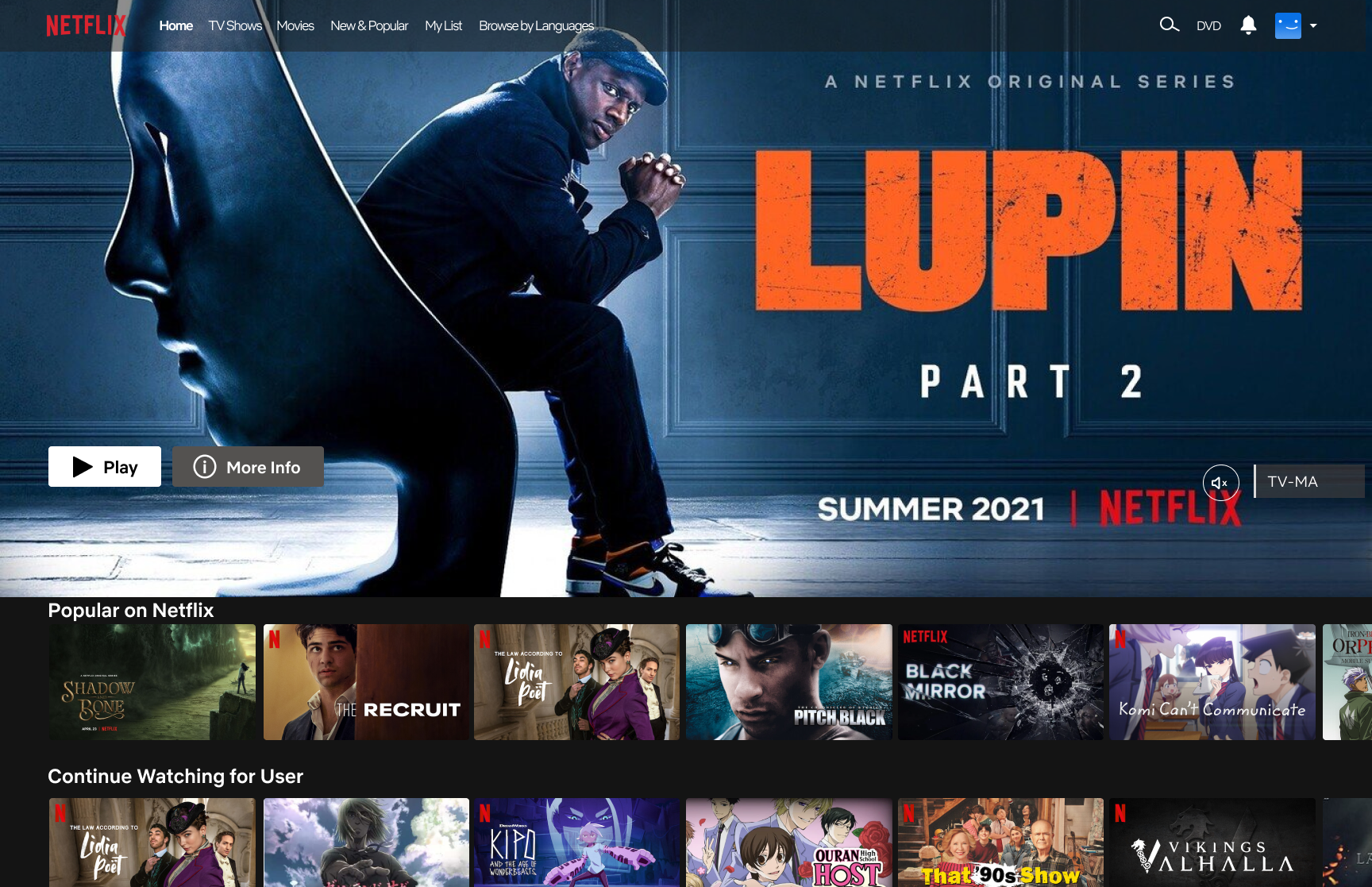
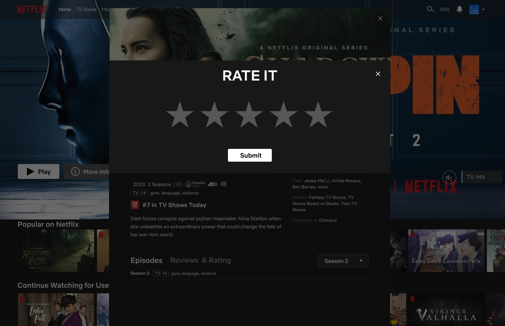
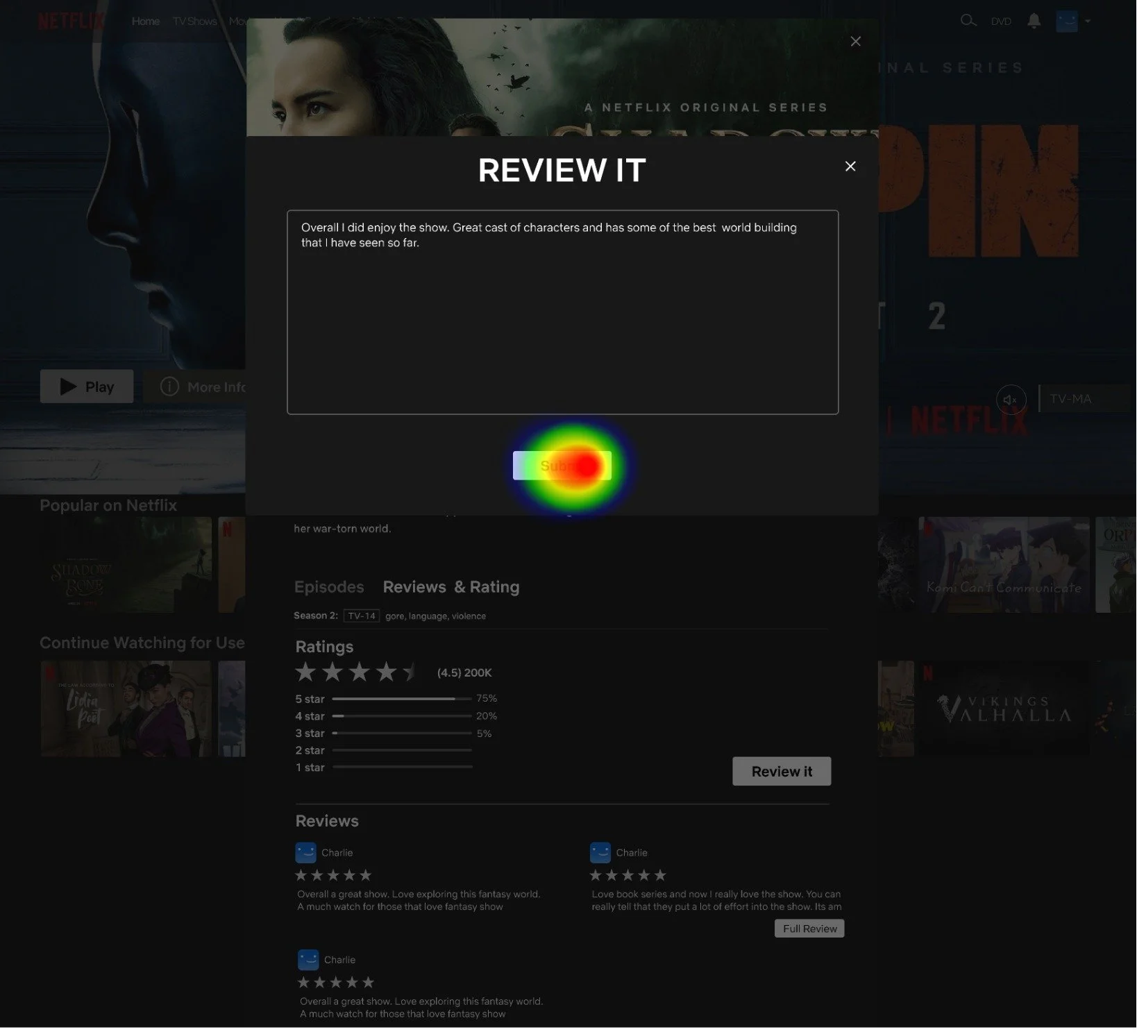
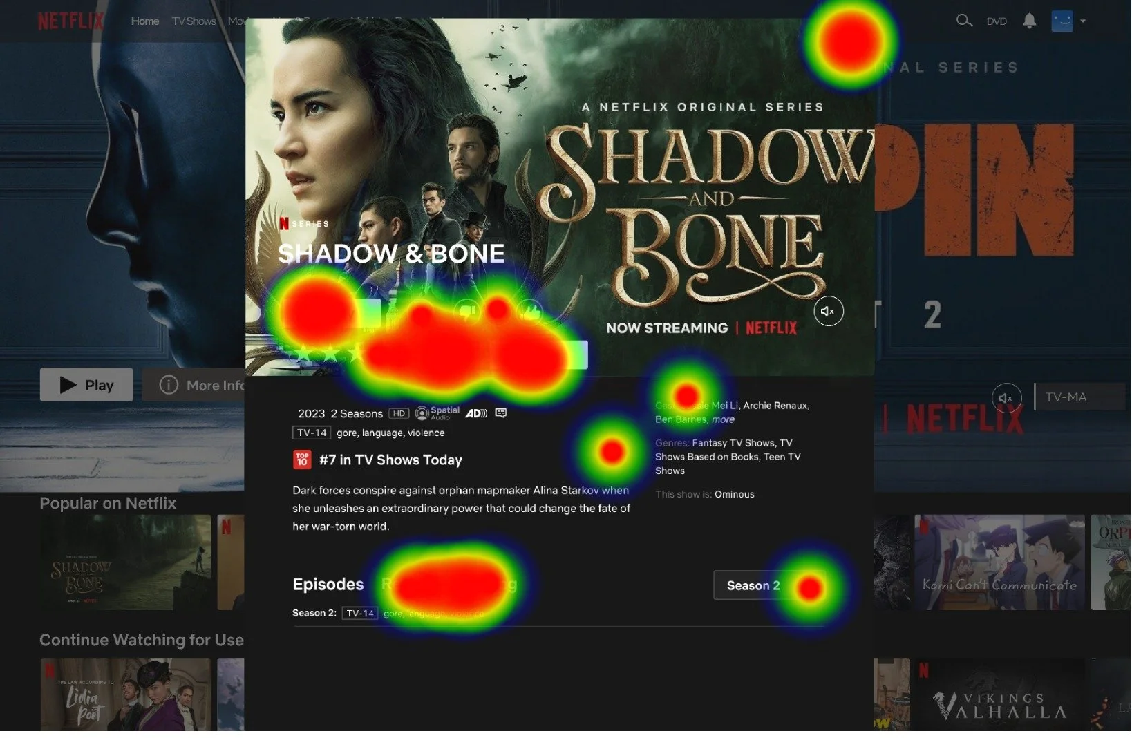
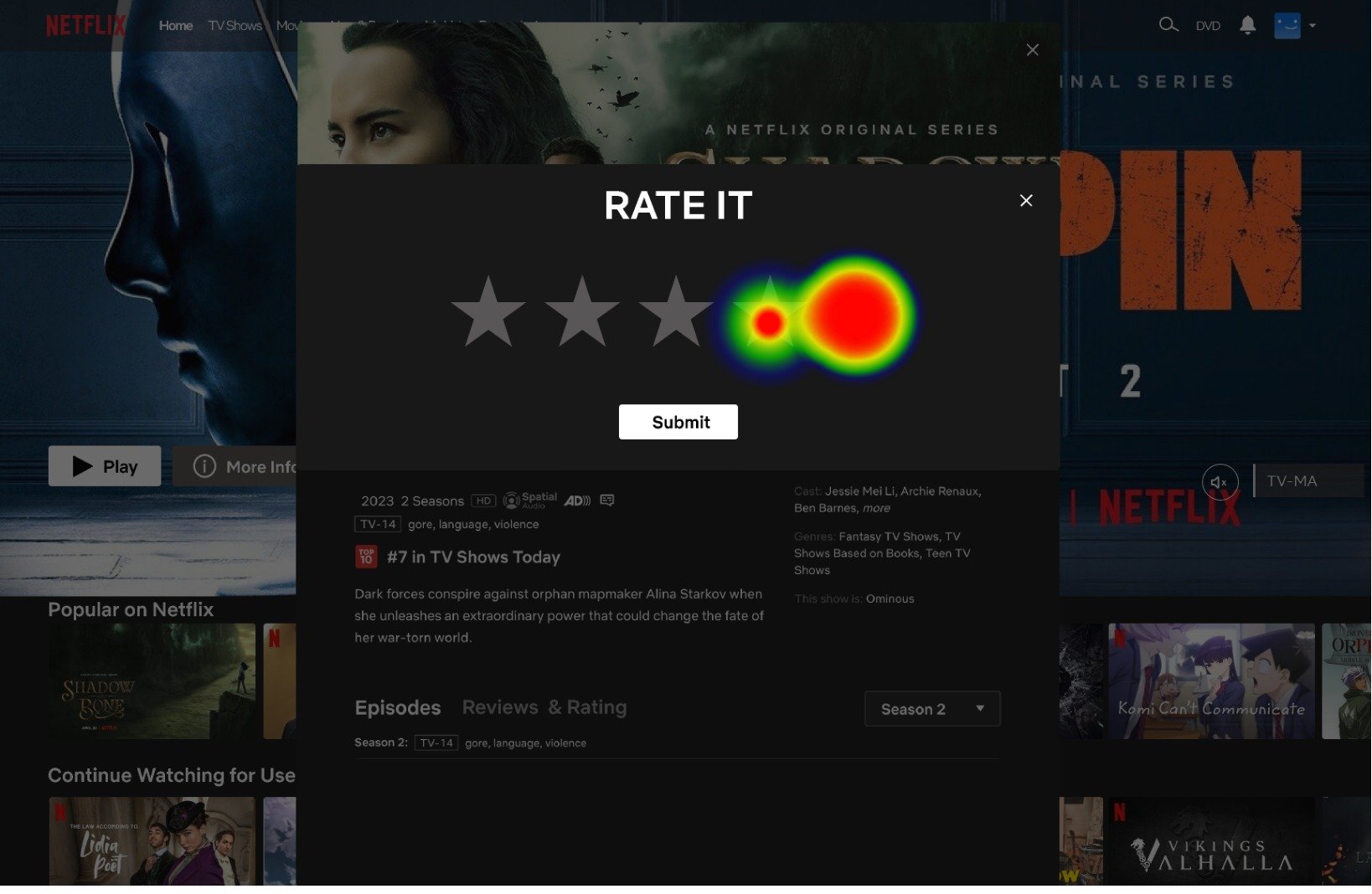
I skipped the mid-fidelity wireframing stages since I was simply adding a feature to an existing project. With high-fidelity wireframes, I seamlessly integrated my design into Netflix's existing layout and color scheme, providing a final visual representation of how the feature would appear within the platform.
UI Design Kit
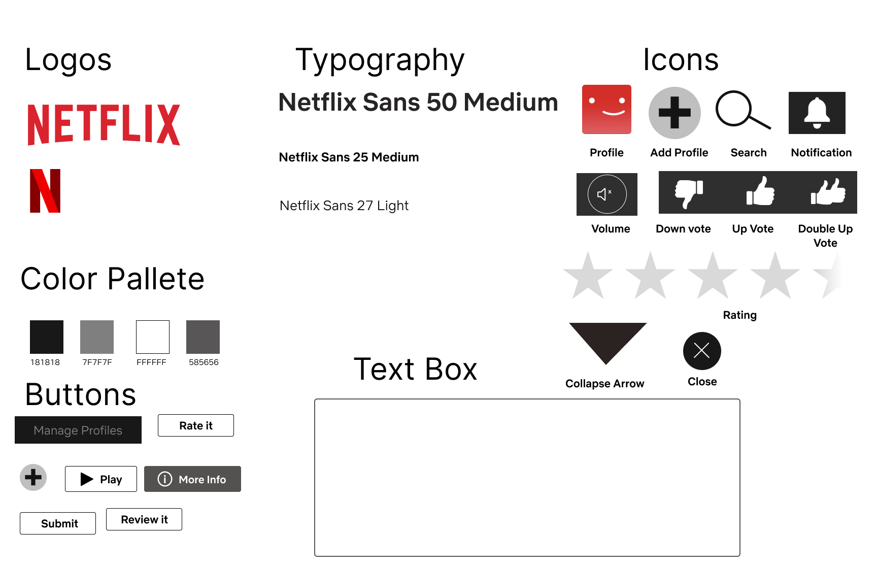
UI kits serve as a reference for others interested in recreating or enhancing my design. Utilizing Netflix's existing logos, icons, and fonts from their site, I incorporated these elements into my design to maintain consistency with the platform's branding.
Logo and Icons:
The logo was straightforward; I utilized the one provided by Netflix. However, recreating the icons proved challenging due to Netflix's diverse iconography. After struggling to find suitable alternatives, I ultimately opted to create them myself.
Usability
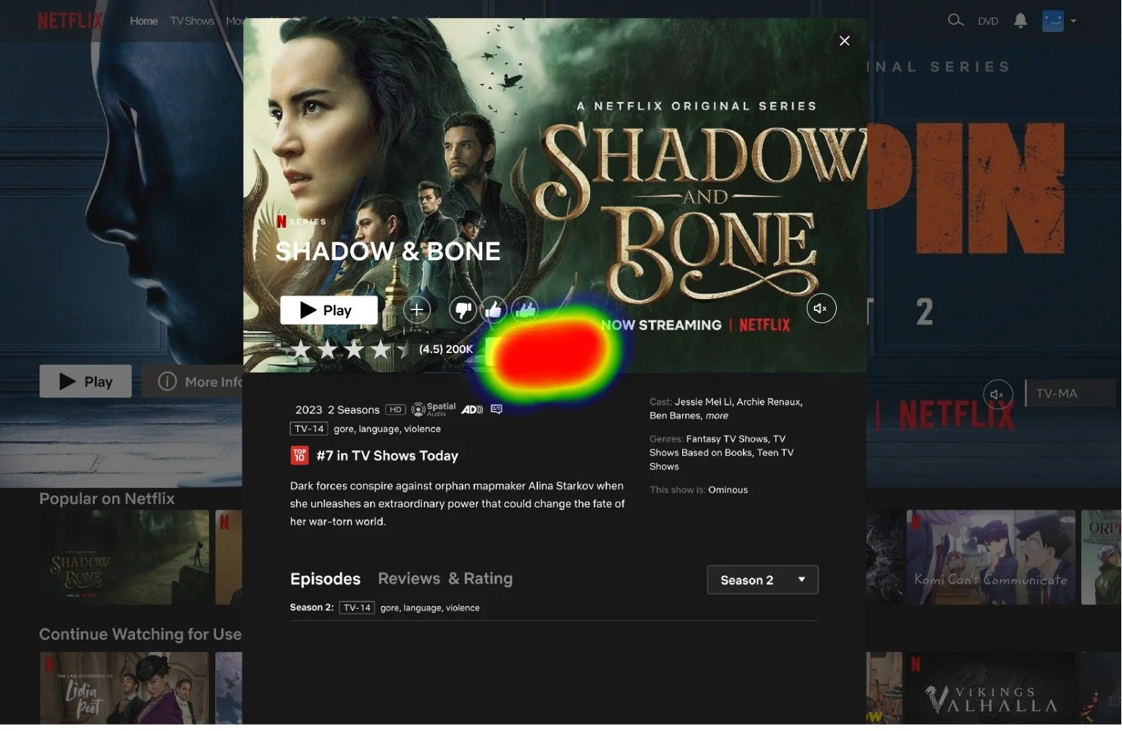
For the final phase of my project, I conducted usability tests on Netflix using the website Maze to assess the functionality of the feature. The objective was for users to review a show, rate it, and view the reviews list. Six users participated in the test, which I monitored. Here are the key observations and feedback:
Overall, users found the process fast and straightforward.
Some users experienced a slight delay in locating the Reviews and Rating tab, approximately one second.
Feedback was generally positive, with only one user suggesting a different design for the review section.
Final thoughts
Iterations and Takeaways
Working with constraints: Constraints play a vital role in guiding a project. While adding a feature to an existing product simplifies certain aspects like color schemes and task flows, it also limits design flexibility, requiring alignment with the existing framework.
Learning about Netflix: Initially, I questioned Netflix's decision to remove the comments and review system, suspecting it was for control purposes. However, as I delved deeper, I grasped their rationale. While the matching system requires updates, it generally caters well to viewers' needs.
Iteration: Future steps would involve designing mobile and tablet interfaces, followed by usability testing. Upon successful validation, the feature would be implemented on the Netflix website to gauge user response.

